Documentation
Design Docs & Other Material
Master Design WikiRed 5 Studios
One of the early duties I was assigned when I joined the project was to organize the company "Master Design Document" into a cogent and presentable format that all departments could access. Since the company chose to use an internal Wikipedia, I utilized my graphic design skills and theme management software that supported .CSS to create an internal Wiki.
My main objectives were to create an engaging document that the team enjoyed reading and provide an in-depth and accurate concision to the wordy walls of text that filled the document before me. Since it was a living document, I was also faced with ensuring that the designers who were familiar with importing data into a Wiki page would not have to re-learn some new process with the new format. The end result was a legible, easy-to-read collection of design documents that possessed more functionality and better aesthetics than its predecessor.
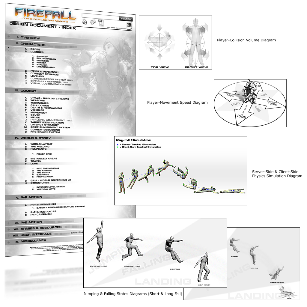
I also began work on drafting several documents based on material discussed in designer meetings. To assist in keeping my documentation concise, I created several illustrative diagrams that explained the features alongside the text. These features included everything from "Player-Collision Volumes" to "Server-Side vs. Client-Side Physics Simulations" and "Animation States in Jumping and Falling Cycles."
The illustrations packed 1000 words into a few pages worth of documentation and afforded the team rapid access and acquisition of pertinent information. Basic verbal communication was always preferred over lengthy documentation but having every feature in print impressed the publishers as these illustrated documents were compiled into a 3-ringed binder and presented as part of the deliverables in our milestone submissions.
|
|
Other Web WorkRed 5 Studios
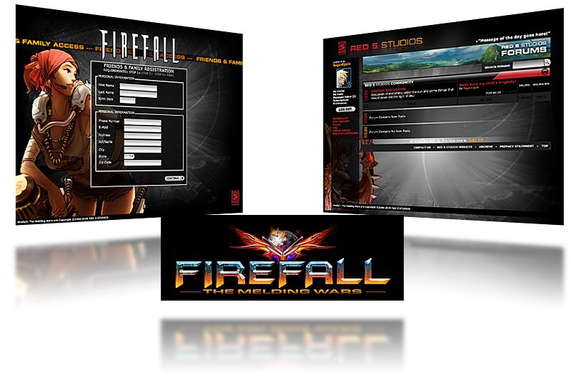
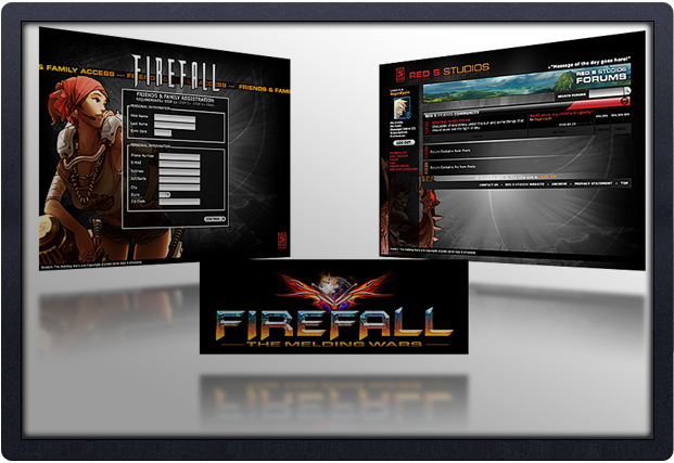
In addition to the Master Design Wiki, I was asked to design various other web-based and artistic material. The community manager who was also in charge of creating the webpages and forums that visitors to the Red 5 Studios website encountered asked me to design the layout and user-interface for the the impending "Friends & Family Alpha/Beta" access. These webpages also compelled me to present the art team with a possible title logo for the project. The "Firefall" (working title) logo I designed was later used for several promotional media presentations and even found its way onto coworkers' desktops. Ultimately, it was used as part of the placeholder user-interface shell (main title screen).
|
|
Additional Artwork & Placeholder AssetsRed 5 Studios
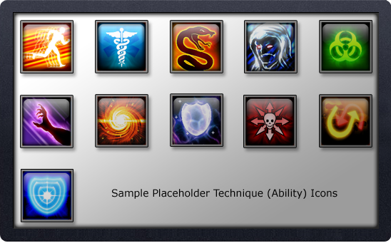
Beyond web design, copy writing and logo creation, I also contributed to a lot of placeholder assets that helped drive the direction of key elements. Among these placeholder assets, I created all the first-pass particle effects for weapons and abilities (refered to as "Techniques"). Other assets included the Technique icons, HUD (heads-up display) and various other user-interface (UI from here on) menus. Even though most of my placeholder work was considered "throw away", it served as great testing tools to gauge the user experience. Since the UI is an integral part of the user experience often over-looked or relegated to the last part of production, being able to experiment and iterate on it during the early stages of pre-production allowed our team to create an intuitive, stream-lined interface that was fun to use.
Other art assets I created consisted of: Class (refered to as "Battleframes") Icons, UI mock-ups for all proposed design systems and promotional media for both inter-department use and corporate presentations.
|
|
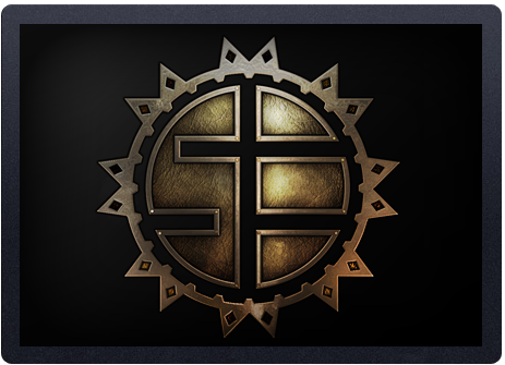
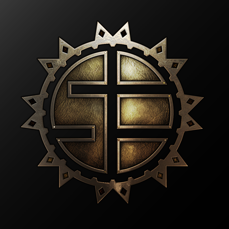
Another example of an art asset that was included in the launch of the game was a company emblem for one of the various alien factions in "Defiance." This image represents the "Soleptor Enterprises" company and utilized an aesthetic similar to the I-Ching.
|
|